/* global React */
// Showcase Page — Heritage of Mysore · Bento Grid

/* ==================== HERO ==================== */
const ShowcaseHero = () => {
  const isMobile = useIsMobile();
  return (
  <section style={{ padding: '72px 0 56px', borderBottom: '1px solid var(--ra-border)' }}>
    <div className="ra-container">
      <div style={{ display: 'grid', gridTemplateColumns: isMobile ? '1fr' : '1fr auto', gap: 48, alignItems: 'end' }}>
        <div>
          <div className="ra-label ra-label-tick" style={{ marginBottom: 18 }}>
            Building Mysore Since 1972
          </div>
          <h1 className="ra-display-xl" style={{ lineHeight: 0.88 }}>
            Heritage<br/>
            <span style={{ background: 'var(--ra-yellow)', padding: '0 14px' }}>Showcase.</span>
          </h1>
          <p style={{ fontSize: 18, color: 'var(--ra-muted)', maxWidth: 720, marginTop: 32, lineHeight: 1.65 }}>
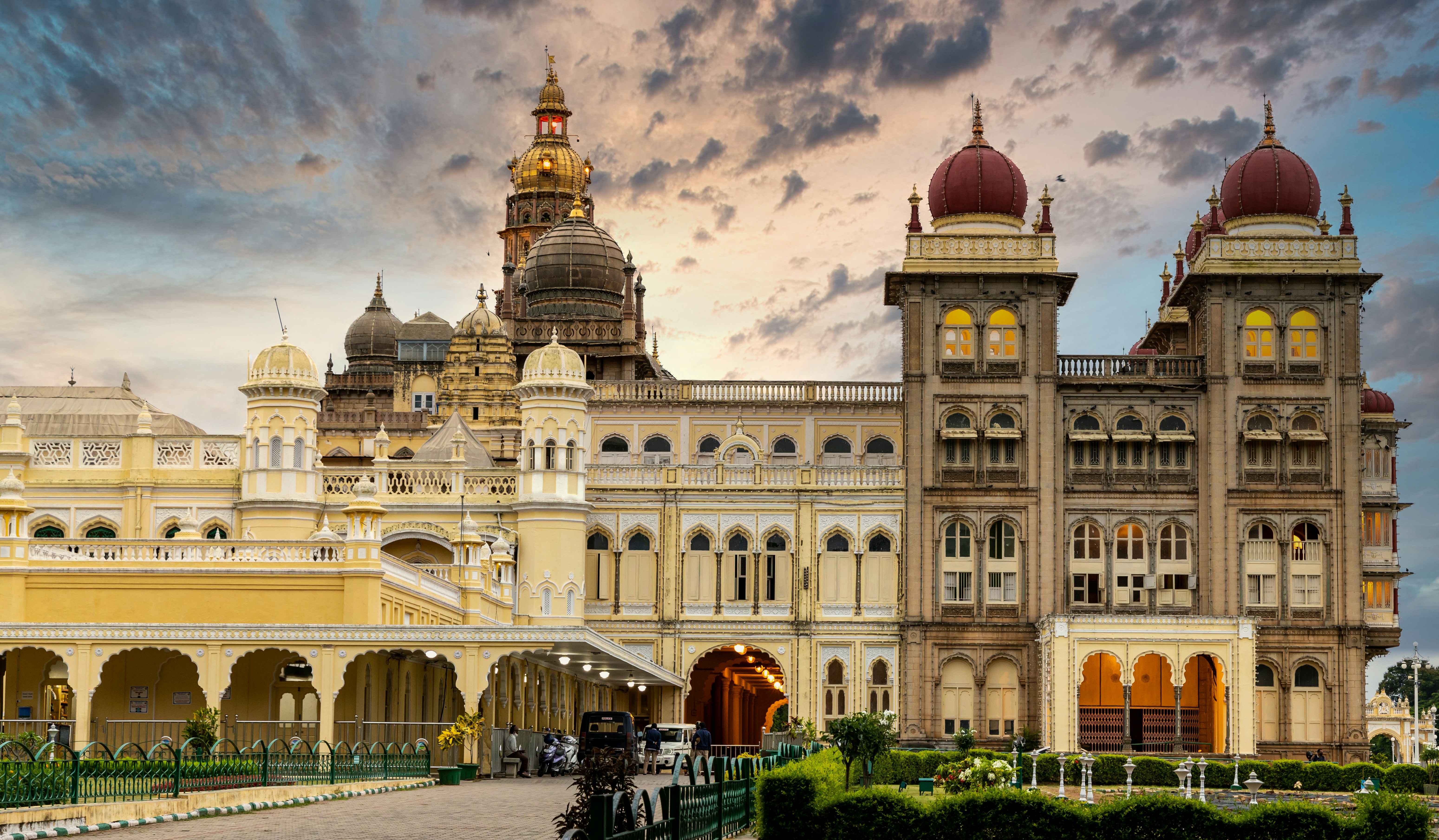
            For over five decades, Raghuveer Agencies has been the trusted foundation
            for Mysore's most iconic landmarks. We don't just supply cement — we supply
            the strength that defines our city's skyline.
          </p>
        </div>

        {/* PLATINUM PARTNER BADGE */}
        <div style={{
          background: 'var(--ra-yellow)', color: 'var(--ra-yellow-ink)',
          padding: '18px 24px', minWidth: 260, position: 'relative'
        }}>
          <div className="ra-mono" style={{ fontSize: 10, letterSpacing: 2, color: 'var(--ra-yellow-ink)' }}>
            ★★★★★ · TIER
          </div>
          <div style={{
            fontFamily: 'var(--ra-font-display)', fontWeight: 900,
            textTransform: 'uppercase', fontSize: 22, lineHeight: 1.05, marginTop: 10
          }}>
            Authorized<br/>UltraTech<br/>Platinum Partner
          </div>
          <div className="ra-mono" style={{ fontSize: 10, letterSpacing: 2, marginTop: 12, color: 'var(--ra-yellow-ink)' }}>
            SINCE 1972 · MYSURU
          </div>
        </div>
      </div>
    </div>
  </section>
  );
};

/* ==================== LANDMARK ILLUSTRATIONS ==================== */

const MysorePalaceImg = () => (
  <img
    src="assets/heritage-mysore-palace.jpg"
    alt="Mysore Palace"
    style={{ width: '100%', height: '100%', objectFit: 'cover', display: 'block' }}
  />
);

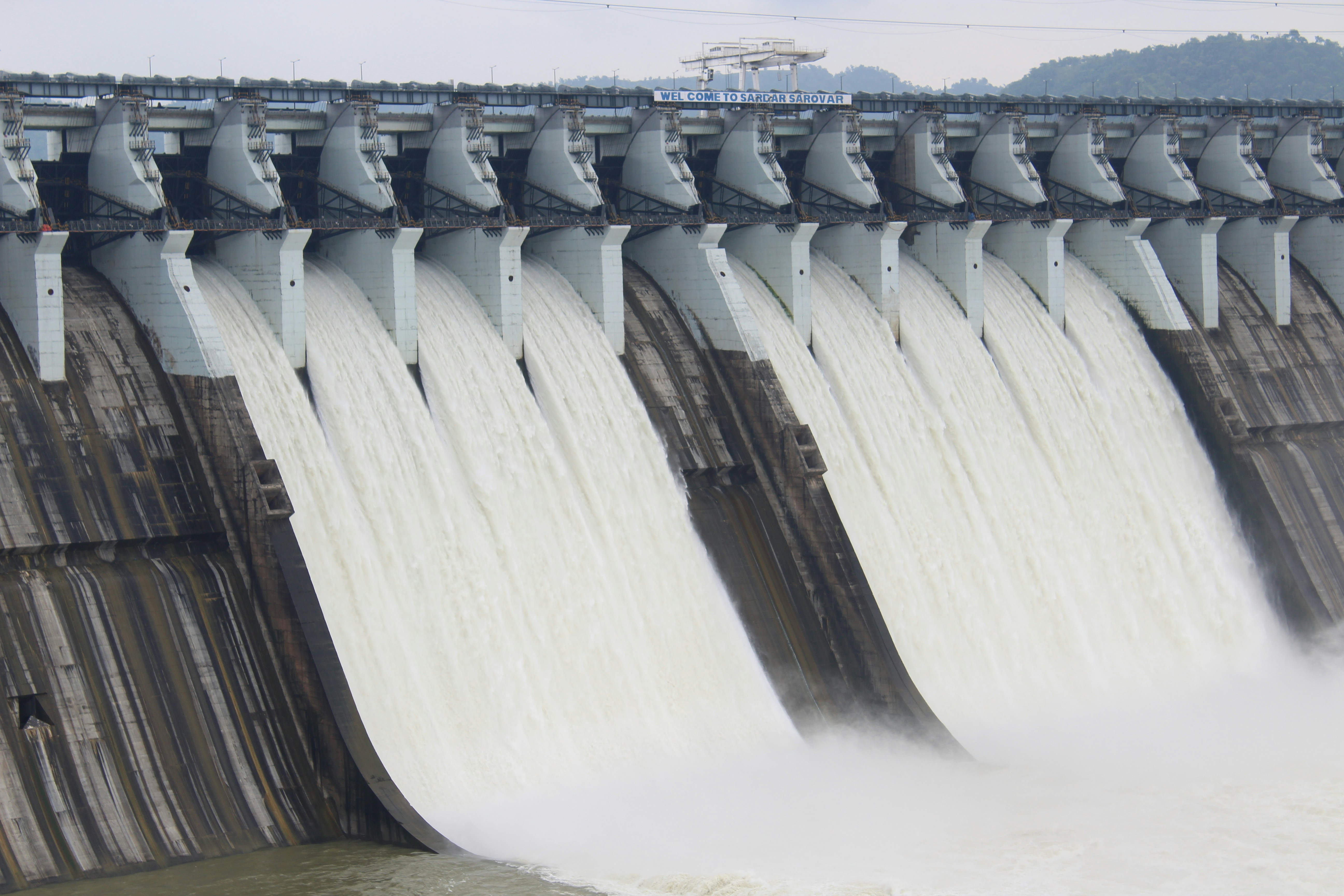
const KRSDamImg = () => (
  <img
    src="assets/heritage-krs-dam.jpg"
    alt="KRS Dam — Krishnaraja Sagara, Mandya"
    style={{ width: '100%', height: '100%', objectFit: 'cover', display: 'block' }}
  />
);

const ChamundiTempleImg = () => (
  <svg viewBox="0 0 800 600" width="100%" height="100%" preserveAspectRatio="xMidYMid slice"
       style={{ display: 'block', background: '#6E6158' }}>
    <defs>
      <linearGradient id="skyC" x1="0" y1="0" x2="0" y2="1">
        <stop offset="0" stopColor="#9A9087"/><stop offset="1" stopColor="#4F4740"/>
      </linearGradient>
    </defs>
    <rect width="800" height="600" fill="url(#skyC)"/>
    {/* hill silhouette */}
    <path d="M0 500 Q200 450 400 440 Q600 430 800 490 L800 600 L0 600 Z" fill="#2E2824"/>
    <path d="M0 480 Q200 430 400 420 Q600 410 800 470 L800 600 L0 600 Z" fill="#39322C" opacity="0.7"/>
    {/* temple platform */}
    <rect x="280" y="380" width="240" height="40" fill="#1F1B18"/>
    {/* gopuram (pyramid tower) — 8 stepped tiers */}
    {Array.from({length:8}).map((_,i)=>{
      const y = 380 - i*40;
      const w = 240 - i*22;
      const x = 400 - w/2;
      return (
        <g key={i}>
          <rect x={x} y={y-30} width={w} height="30" fill={i%2?'#2E2824':'#3F382F'}/>
          {/* sculpture dots */}
          {Array.from({length:Math.max(3, 9-i)}).map((_,j)=>(
            <rect key={j} x={x+10+j*((w-20)/Math.max(3,9-i))} y={y-24} width="6" height="16" fill="#14110F"/>
          ))}
          <rect x={x-4} y={y-32} width={w+8} height="4" fill="#5C544C"/>
        </g>
      );
    })}
    {/* kalasha on top */}
    <rect x="395" y="36" width="10" height="28" fill="#2E2824"/>
    <circle cx="400" cy="28" r="10" fill="#6E6158"/>
    <path d="M395 20 L400 6 L405 20 Z" fill="#4A4238"/>
    {/* side lanterns */}
    <rect x="260" y="360" width="8" height="60" fill="#1F1B18"/>
    <rect x="532" y="360" width="8" height="60" fill="#1F1B18"/>
    <circle cx="264" cy="356" r="6" fill="var(--ra-yellow)" opacity="0.7"/>
    <circle cx="536" cy="356" r="6" fill="var(--ra-yellow)" opacity="0.7"/>
    {/* foreground steps */}
    <rect x="0" y="520" width="800" height="20" fill="#14110F"/>
    <rect x="0" y="540" width="800" height="20" fill="#1F1B18"/>
    <rect x="0" y="560" width="800" height="20" fill="#2E2824"/>
  </svg>
);

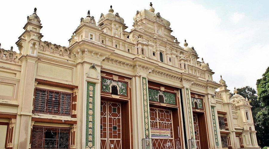
const JaganmohanImg = () => (
  <img
    src="assets/showcase-jaganmohan-palace.jpg"
    alt="Jaganmohan Palace Art Gallery — Mysuru"
    style={{ width: '100%', height: '100%', objectFit: 'cover', display: 'block' }}
  />
);

/* ==================== HERITAGE BENTO GRID ==================== */
const HeritageGrid = () => {
  const isMobile = useIsMobile();
  return (
    <section style={{ padding: isMobile ? '48px 0' : '96px 0', background: 'var(--ra-bg)' }}>
      <div className="ra-container">

        {/* header */}
        <div style={{ display: 'grid', gridTemplateColumns: '200px 1fr', gap: 48, marginBottom: 56, alignItems: 'start' }}>
          <div className="ra-mono" style={{ color: 'var(--ra-muted)', fontSize: 12, letterSpacing: 2 }}>
            01 / PORTFOLIO
          </div>
          <div>
            <h2 className="ra-display-l" style={{ lineHeight: 0.95 }}>
              Five Landmarks.<br/>Five Decades of Trust.
            </h2>
            <p style={{ fontSize: 16, color: 'var(--ra-muted)', maxWidth: 640, marginTop: 20, lineHeight: 1.7 }}>
              A selection of heritage, civic and industrial projects where
              Raghuveer Agencies supplied certified UltraTech cement.
            </p>
          </div>
        </div>

        {/* BENTO GRID — 3 columns × 2 rows */}
        <div style={{
          display: 'grid',
          gridTemplateColumns: isMobile ? '1fr' : '1.4fr 1fr 1fr',
          gridTemplateRows: isMobile ? 'auto' : 'minmax(300px, 1fr) minmax(300px, 1fr)',
          gap: 2, background: 'var(--ra-border-strong)',
        }}>
          {/* 1. MYSORE PALACE — spans left column 2 rows */}
          <BentoCard
            style={{ gridColumn: '1', gridRow: '1 / span 2' }}
            label="Restoration Supply · 2018"
            tag="Iconic Landmark"
            title="Mysore Palace"
            kn="ಮೈಸೂರು ಅರಮನೆ"
            material="UltraTech Premium PPC Cement"
            desc="Used for structural reinforcement and external façade preservation of the royal heritage site."
            image={<MysorePalaceImg/>}
            highlight="yellow-stripe"
            feature
          />

          {/* 2. KRS DAM — top right */}
          <BentoCard
            style={{ gridColumn: '2 / span 2', gridRow: '1' }}
            label="Critical Infrastructure"
            title="Krishna Raja Sagara Dam"
            subtitle="Srirangapatna · Mandya"
            material="UltraTech Super & Bulk Cement"
            image={<KRSDamImg/>}
            layout="horizontal"
          />

          {/* 3. CHAMUNDI TEMPLE — middle right */}
          <BentoCard
            style={{ gridColumn: '2', gridRow: '2' }}
            label="Religious Heritage"
            title="Chamundeshwari Temple"
            subtitle="Chamundi Hill · Mysuru"
            material="UltraTech Weather Pro"
            image={<ChamundiTempleImg/>}
          />

          {/* 4. BRBNMPL — bottom right */}
          <BentoCard
            style={{ gridColumn: '3', gridRow: '2' }}
            label="Strategic Industrial"
            title="BRBNMPL"
            subtitle="Bharatiya Reserve Bank Note Mudran Pvt. Ltd, Mysuru"
            material="UltraTech 53 Grade"
            desc="High-strength industrial concrete supply."
            dark
          />
        </div>

        {/* 5. JAGANMOHAN — full width split row below */}
        <div style={{
          display: 'grid', gridTemplateColumns: isMobile ? '1fr' : '1fr 1.2fr',
          marginTop: 2, background: 'var(--ra-border-strong)', gap: 2
        }}>
          {/* dark left */}
          <div style={{ background: 'var(--ra-ink)', color: '#fff', padding: 48, display: 'flex', flexDirection: 'column', justifyContent: 'space-between', minHeight: 380 }}>
            <div>
              <div className="ra-mono" style={{ fontSize: 11, letterSpacing: 2, color: 'var(--ra-yellow)' }}>
                05 · HERITAGE RESTORATION
              </div>
              <h3 style={{
                fontFamily: 'var(--ra-font-display)', fontWeight: 900,
                textTransform: 'uppercase', fontSize: 42, lineHeight: 1.02,
                marginTop: 18, color: '#fff', letterSpacing: '-0.01em'
              }}>
                Jaganmohan Palace<br/>Art Gallery
              </h3>
              <div className="ra-kn-label" style={{ color: '#8A8A8A', marginTop: 10 }}>
                ಜಗನ್ಮೋಹನ ಅರಮನೆ
              </div>
              <p style={{ color: '#C9BFB2', fontSize: 15, lineHeight: 1.7, maxWidth: 420, marginTop: 24 }}>
                Specialty-grade material supply for restoration and preservation
                of the historic art gallery — where structural care meets the
                preservation of Wodeyar-era heritage.
              </p>
            </div>
            <div style={{ display: 'grid', gridTemplateColumns: '1fr 1fr', gap: 2, background: '#2A2A2A', marginTop: 24 }}>
              <div style={{ background: 'var(--ra-ink)', padding: '14px 16px' }}>
                <div className="ra-mono" style={{ fontSize: 10, color: '#8A8A8A', letterSpacing: 2 }}>MATERIAL</div>
                <div style={{ fontFamily: 'var(--ra-font-display)', fontWeight: 700, fontSize: 15, color: '#fff', marginTop: 6, textTransform: 'uppercase', lineHeight: 1.3 }}>
                  UltraTech Specialty<br/>Chemical Additives
                </div>
              </div>
              <div style={{ background: 'var(--ra-ink)', padding: '14px 16px' }}>
                <div className="ra-mono" style={{ fontSize: 10, color: '#8A8A8A', letterSpacing: 2 }}>PROGRAMME</div>
                <div style={{ fontFamily: 'var(--ra-font-display)', fontWeight: 700, fontSize: 15, color: 'var(--ra-yellow)', marginTop: 6, textTransform: 'uppercase' }}>
                  Ongoing
                </div>
              </div>
            </div>
          </div>
          {/* image right */}
          <HoverPhoto>
            <JaganmohanImg/>
          </HoverPhoto>
        </div>
      </div>
    </section>
  );
};

/* ==================== BENTO CARD ==================== */
const HoverPhoto = ({ children }) => (
  <div className="ra-hero-photo" style={{
    position: 'relative', overflow: 'hidden',
    height: '100%', minHeight: 300, width: '100%',
    background: 'var(--ra-ink)', flex: 1, alignSelf: 'stretch',
  }}>
    <div className="ra-hero-photo__inner" style={{
      position: 'absolute', inset: 0,
      filter: 'grayscale(100%) contrast(1.05)',
      transition: 'filter 600ms ease'
    }}>
      {children}
    </div>
  </div>
);

const BentoCard = ({
  label, tag, title, kn, subtitle, material, desc,
  image, style, feature, dark, layout, highlight
}) => {
  const isDark = !!dark;
  const bg = isDark ? 'var(--ra-ink)' : '#fff';
  const fg = isDark ? '#fff' : 'var(--ra-ink)';
  const mut = isDark ? '#8A8A8A' : 'var(--ra-muted)';
  const labelCol = isDark ? 'var(--ra-yellow)' : 'var(--ra-ink)';

  // Horizontal layout = photo left, copy right
  if (layout === 'horizontal') {
    return (
      <div style={{ ...style, background: bg, display: 'grid', gridTemplateColumns: '1.3fr 1fr', minHeight: 300 }}>
        <HoverPhoto>{image}</HoverPhoto>
        <div style={{ padding: 32, display: 'flex', flexDirection: 'column', justifyContent: 'space-between' }}>
          <div>
            <div style={{ display: 'flex', justifyContent: 'space-between', alignItems: 'flex-start' }}>
              <div className="ra-label ra-label-tick" style={{ color: labelCol }}>{label}</div>
              <div className="ra-mono" style={{ color: mut, fontSize: 11, letterSpacing: 2 }}>02</div>
            </div>
            <h3 style={{
              fontFamily: 'var(--ra-font-display)', fontWeight: 900,
              textTransform: 'uppercase', fontSize: 28, lineHeight: 1.02,
              marginTop: 16, color: fg, letterSpacing: '-0.01em'
            }}>{title}</h3>
            {subtitle && (
              <div className="ra-mono" style={{ color: mut, fontSize: 11, letterSpacing: 1.5, marginTop: 8 }}>
                {subtitle.toUpperCase()}
              </div>
            )}
          </div>
          <div style={{ paddingTop: 16, borderTop: `1px solid ${isDark ? '#2A2A2A' : 'var(--ra-border)'}` }}>
            <div className="ra-mono" style={{ fontSize: 10, color: mut, letterSpacing: 2 }}>MATERIAL</div>
            <div style={{ fontFamily: 'var(--ra-font-display)', fontWeight: 700, fontSize: 14, color: fg, marginTop: 6, textTransform: 'uppercase', lineHeight: 1.3 }}>
              {material}
            </div>
          </div>
        </div>
      </div>
    );
  }

  // Dark solid card (no image) — for BRBNMPL
  if (isDark && !image) {
    return (
      <div style={{
        ...style, background: bg, color: fg,
        padding: 28, display: 'flex', flexDirection: 'column',
        justifyContent: 'space-between', position: 'relative', overflow: 'hidden'
      }}>
        {/* corner yellow tag */}
        <div style={{
          position: 'absolute', top: 0, right: 0,
          background: 'var(--ra-yellow)', color: 'var(--ra-yellow-ink)',
          padding: '6px 10px', fontFamily: 'var(--ra-font-mono)',
          fontSize: 10, letterSpacing: 2
        }}>04</div>
        {/* grid background */}
        <div style={{
          position: 'absolute', inset: 0, opacity: 0.35, pointerEvents: 'none',
          backgroundImage: 'linear-gradient(#222 1px, transparent 1px), linear-gradient(90deg, #222 1px, transparent 1px)',
          backgroundSize: '36px 36px'
        }}/>
        <div style={{ position: 'relative' }}>
          <div className="ra-label ra-label-tick" style={{ color: 'var(--ra-yellow)' }}>{label}</div>
          <h3 style={{
            fontFamily: 'var(--ra-font-display)', fontWeight: 900,
            textTransform: 'uppercase', fontSize: 32, lineHeight: 1.02,
            marginTop: 18, color: '#fff', letterSpacing: '-0.01em'
          }}>{title}</h3>
          {subtitle && (
            <div style={{ color: '#C9BFB2', fontSize: 12.5, marginTop: 10, maxWidth: 280, lineHeight: 1.5 }}>
              {subtitle}
            </div>
          )}
          {desc && (
            <p style={{ color: '#C9BFB2', fontSize: 13, marginTop: 14, lineHeight: 1.6 }}>
              {desc}
            </p>
          )}
        </div>
        <div style={{ paddingTop: 14, borderTop: '1px solid #2A2A2A', position: 'relative' }}>
          <div className="ra-mono" style={{ fontSize: 10, color: '#8A8A8A', letterSpacing: 2 }}>MATERIAL</div>
          <div style={{
            fontFamily: 'var(--ra-font-display)', fontWeight: 700, fontSize: 14,
            color: 'var(--ra-yellow)', marginTop: 6, textTransform: 'uppercase'
          }}>
            {material}
          </div>
        </div>
      </div>
    );
  }

  // Feature card — Mysore Palace: large photo area + dense copy
  if (feature) {
    return (
      <div style={{ ...style, background: bg, display: 'flex', flexDirection: 'column', minHeight: 640 }}>
        <div style={{ position: 'relative', flex: 1, minHeight: 380 }}>
          <HoverPhoto>{image}</HoverPhoto>
          {/* yellow tag corner */}
          <div style={{
            position: 'absolute', top: 0, left: 0,
            background: 'var(--ra-yellow)', color: 'var(--ra-yellow-ink)',
            padding: '10px 14px', fontFamily: 'var(--ra-font-mono)',
            fontSize: 11, letterSpacing: 2, zIndex: 2
          }}>
            01 · FEATURED
          </div>
          {tag && (
            <div style={{
              position: 'absolute', bottom: 16, left: 16,
              background: 'rgba(26,26,26,0.85)', color: '#fff',
              padding: '8px 12px', fontFamily: 'var(--ra-font-mono)',
              fontSize: 10, letterSpacing: 2, textTransform: 'uppercase'
            }}>
              {tag}
            </div>
          )}
        </div>
        <div style={{ padding: 32 }}>
          <div className="ra-label ra-label-tick">{label}</div>
          <h3 style={{
            fontFamily: 'var(--ra-font-display)', fontWeight: 900,
            textTransform: 'uppercase', fontSize: 42, lineHeight: 1,
            marginTop: 14, letterSpacing: '-0.01em'
          }}>{title}</h3>
          {kn && <div className="ra-kn-label" style={{ color: 'var(--ra-muted)', marginTop: 8 }}>{kn}</div>}
          <p style={{ color: 'var(--ra-muted)', fontSize: 15, lineHeight: 1.7, marginTop: 16, maxWidth: 460 }}>
            {desc}
          </p>
          <div style={{ marginTop: 22, paddingTop: 16, borderTop: '1px solid var(--ra-border)' }}>
            <div className="ra-mono" style={{ fontSize: 10, color: 'var(--ra-muted)', letterSpacing: 2 }}>MATERIAL</div>
            <div style={{
              fontFamily: 'var(--ra-font-display)', fontWeight: 800, fontSize: 16,
              marginTop: 6, textTransform: 'uppercase', color: 'var(--ra-ink)'
            }}>
              {material}
            </div>
          </div>
        </div>
      </div>
    );
  }

  // Default vertical card — photo on top, copy below
  return (
    <div style={{ ...style, background: bg, display: 'flex', flexDirection: 'column' }}>
      <div style={{ position: 'relative', flex: 1, minHeight: 160 }}>
        <HoverPhoto>{image}</HoverPhoto>
      </div>
      <div style={{ padding: 24 }}>
        <div className="ra-label ra-label-tick">{label}</div>
        <h3 style={{
          fontFamily: 'var(--ra-font-display)', fontWeight: 900,
          textTransform: 'uppercase', fontSize: 24, lineHeight: 1.05,
          marginTop: 12, letterSpacing: '-0.01em'
        }}>{title}</h3>
        {subtitle && (
          <div className="ra-mono" style={{ color: 'var(--ra-muted)', fontSize: 11, letterSpacing: 1.5, marginTop: 6 }}>
            {subtitle.toUpperCase()}
          </div>
        )}
        <div style={{ marginTop: 16, paddingTop: 14, borderTop: '1px solid var(--ra-border)' }}>
          <div className="ra-mono" style={{ fontSize: 10, color: 'var(--ra-muted)', letterSpacing: 2 }}>MATERIAL</div>
          <div style={{
            fontFamily: 'var(--ra-font-display)', fontWeight: 700, fontSize: 14,
            marginTop: 6, textTransform: 'uppercase', color: 'var(--ra-ink)'
          }}>
            {material}
          </div>
        </div>
      </div>
    </div>
  );
};

/* ==================== STATS STRIP ==================== */
const TrustBlock = () => {
  const isMobile = useIsMobile();
  return (
  <section style={{ background: 'var(--ra-ink)', color: '#fff', padding: '80px 0', position: 'relative', overflow: 'hidden' }}>
    <div style={{
      position: 'absolute', inset: 0, opacity: 0.35,
      backgroundImage: 'linear-gradient(#222 1px, transparent 1px), linear-gradient(90deg, #222 1px, transparent 1px)',
      backgroundSize: '64px 64px', pointerEvents: 'none'
    }}/>
    <div className="ra-container" style={{ position: 'relative' }}>
      <div style={{ display: 'grid', gridTemplateColumns: '200px 1fr', gap: 48, marginBottom: 48 }}>
        <div className="ra-mono" style={{ color: '#8A8A8A', fontSize: 12, letterSpacing: 2 }}>02 / TRACK RECORD</div>
        <div>
          <div className="ra-label ra-label-tick" style={{ color: 'var(--ra-yellow)', marginBottom: 14 }}>
            Numbers that build trust
          </div>
          <h2 className="ra-display-m" style={{ color: '#fff', lineHeight: 0.98, maxWidth: 720 }}>
            Five decades of<br/>
            <span style={{ background: 'var(--ra-yellow)', color: 'var(--ra-ink)', padding: '0 10px' }}>unbroken</span> supply.
          </h2>
        </div>
      </div>
      <div style={{
        display: 'grid', gridTemplateColumns: isMobile ? 'repeat(2, 1fr)' : 'repeat(4, 1fr)',
        background: '#2A2A2A', gap: 2
      }}>
        {[
          ['54', 'YRS', 'Unbroken Heritage'],
          ['1.2M', 'TONS', 'Cement Supplied'],
          ['450+', '', 'Projects Delivered'],
          ['1972', 'EST.', "Mysuru's First"],
        ].map(([big, small, label], i) => (
          <div key={label} style={{
            background: 'var(--ra-ink)', padding: '36px 28px',
            display: 'flex', flexDirection: 'column', justifyContent: 'space-between', minHeight: 180
          }}>
            <div className="ra-mono" style={{ color: '#8A8A8A', fontSize: 11, letterSpacing: 2 }}>
              0{i+1}
            </div>
            <div>
              <div style={{ display: 'flex', alignItems: 'baseline', gap: 10 }}>
                <span style={{
                  fontFamily: 'var(--ra-font-display)', fontWeight: 900,
                  fontSize: 72, lineHeight: 0.9, color: 'var(--ra-yellow)', letterSpacing: '-0.02em'
                }}>{big}</span>
                {small && (
                  <span style={{
                    fontFamily: 'var(--ra-font-display)', fontWeight: 800,
                    fontSize: 20, color: '#fff', textTransform: 'uppercase'
                  }}>{small}</span>
                )}
              </div>
              <div style={{
                fontFamily: 'var(--ra-font-display)', fontWeight: 800,
                textTransform: 'uppercase', fontSize: 13, letterSpacing: 1.5,
                color: '#C9BFB2', marginTop: 12
              }}>
                {label}
              </div>
            </div>
          </div>
        ))}
      </div>
    </div>
  </section>
  );
};

/* ==================== FOUNDER QUOTE ==================== */
const FounderQuote = () => (
  <section style={{ padding: '120px 0 140px', background: 'var(--ra-bg)', position: 'relative' }}>
    <div className="ra-container" style={{ maxWidth: 1100, textAlign: 'center', position: 'relative' }}>
      {/* giant opening quote */}
      <div aria-hidden style={{
        fontFamily: 'Georgia, serif', fontWeight: 900,
        fontSize: 260, lineHeight: 0.7, color: 'var(--ra-yellow)',
        marginBottom: -20, userSelect: 'none'
      }}>
        &ldquo;
      </div>
      <blockquote style={{ margin: 0, padding: '0 24px' }}>
        <p style={{
          fontFamily: 'var(--ra-font-display)',
          fontWeight: 500, fontSize: 38, lineHeight: 1.28,
          color: 'var(--ra-ink)', margin: 0, textWrap: 'balance',
          letterSpacing: '-0.01em'
        }}>
          We don&rsquo;t just supply building materials;
          we supply the foundation for
          <span style={{ background: 'var(--ra-yellow)', padding: '0 8px', marginInline: 4 }}>
            Mysore&rsquo;s future
          </span>,
          built on the echoes of its glorious past.
        </p>
      </blockquote>

      {/* divider */}
      <div style={{
        display: 'flex', alignItems: 'center', gap: 16, justifyContent: 'center',
        marginTop: 48
      }}>
        <div style={{ width: 48, height: 2, background: 'var(--ra-ink)' }}/>
        <div className="ra-mono" style={{ color: 'var(--ra-muted)', fontSize: 11, letterSpacing: 3 }}>
          ATTRIBUTION
        </div>
        <div style={{ width: 48, height: 2, background: 'var(--ra-ink)' }}/>
      </div>

      <div style={{
        marginTop: 20,
        fontFamily: 'var(--ra-font-display)', fontWeight: 800,
        textTransform: 'uppercase', fontSize: 18, letterSpacing: 2,
        color: 'var(--ra-ink)'
      }}>
        Founder, Raghuveer Agencies
      </div>
      <div className="ra-mono" style={{ color: 'var(--ra-muted)', fontSize: 12, letterSpacing: 2, marginTop: 8 }}>
        EST. 1972 · MYSURU
      </div>
    </div>
  </section>
);

Object.assign(window, { ShowcaseHero, HeritageGrid, TrustBlock, FounderQuote });
